The ARTE logo is based on a Franklin typeface with a cut-off base, symbolising a radically new approach, just as the founders of ARTE had envisaged.
Visual identity
A graphic identity designed to reflect ARTE’s editorial ambition.
Logo
Primary logo
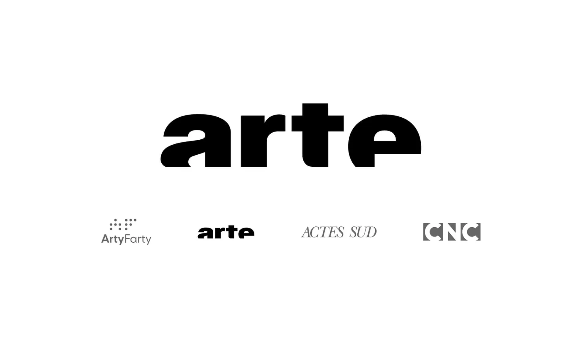
Secondary logo
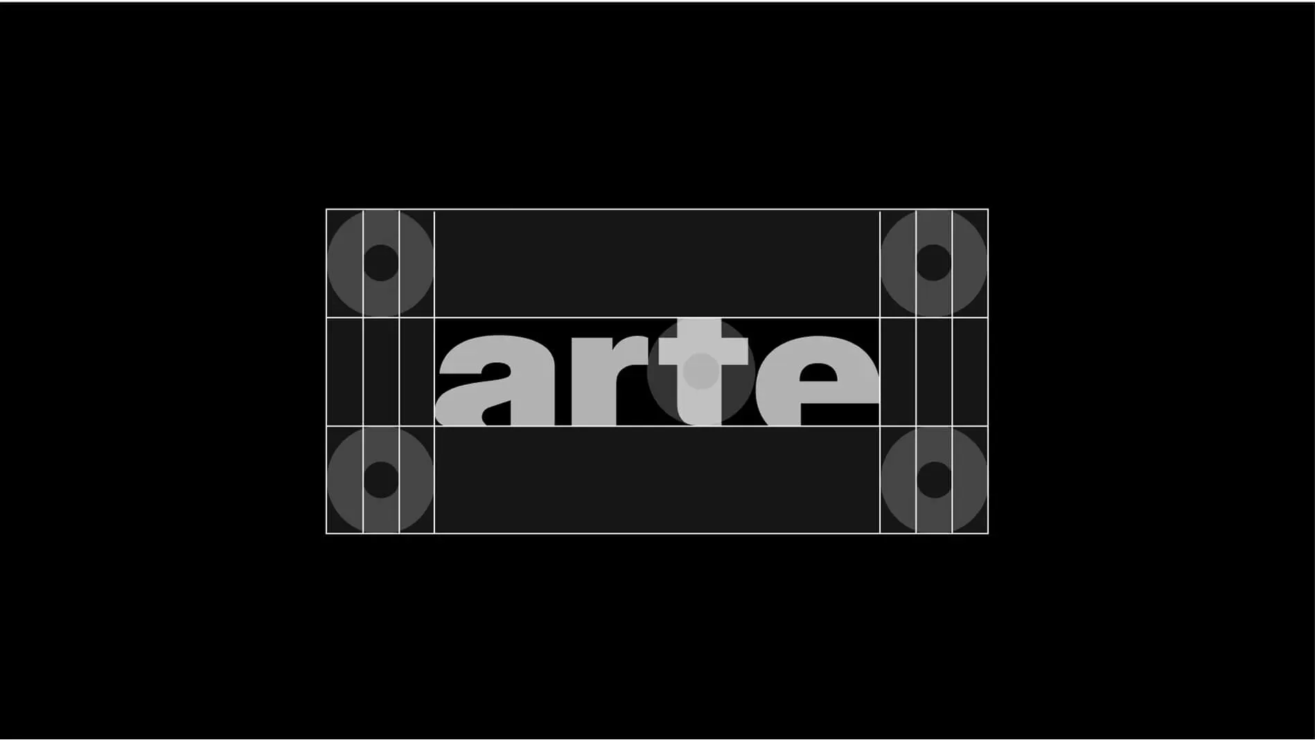
Safe zones
Logo don’ts
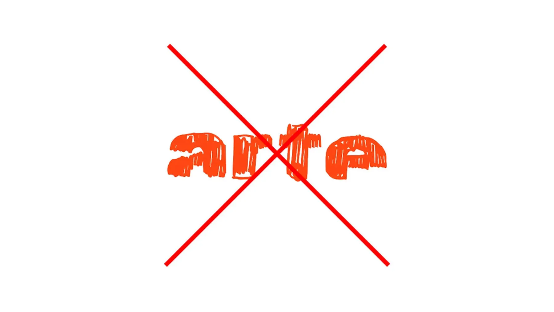
Never attempt to customise the ARTE logo.
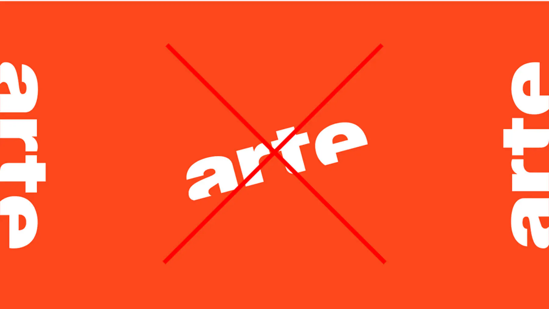
Always position the logo horizontally; never vertically or at an angle.
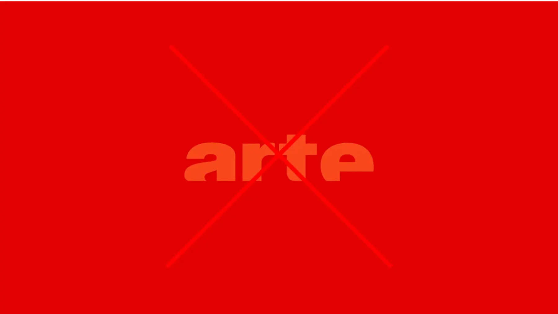
Adjust the colour of the logo (white or orange) to suit the background.
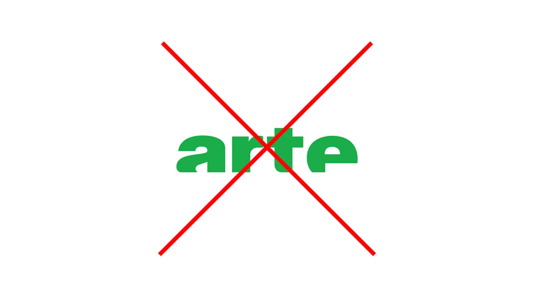
Never change the colour of the logo.
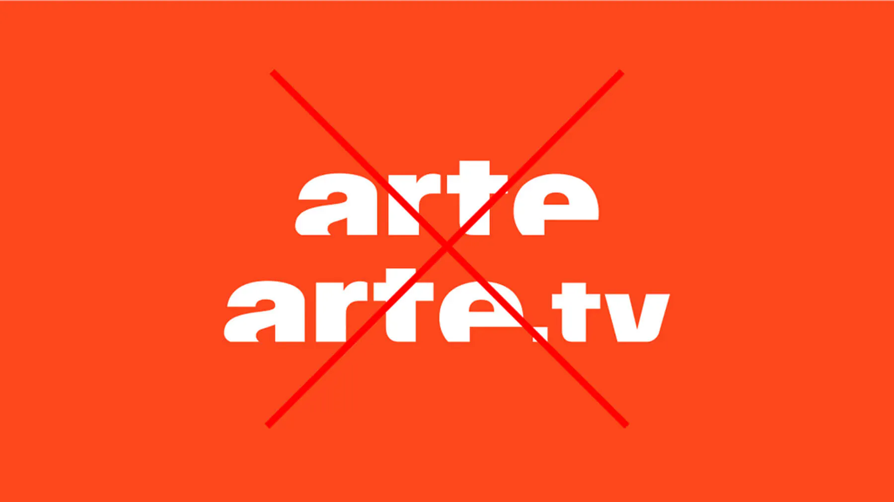
Avoid placing different versions of the logo side by side.
Typography
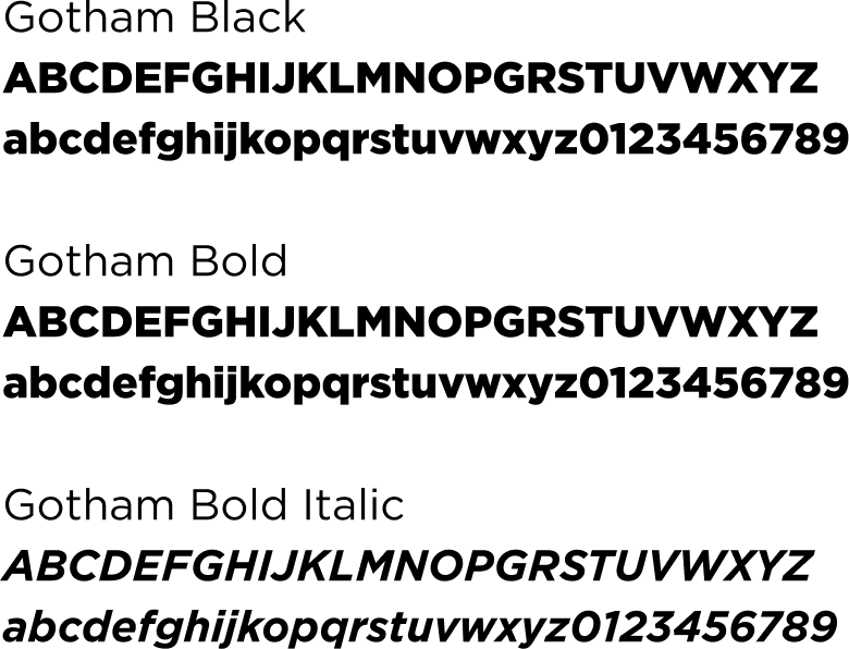
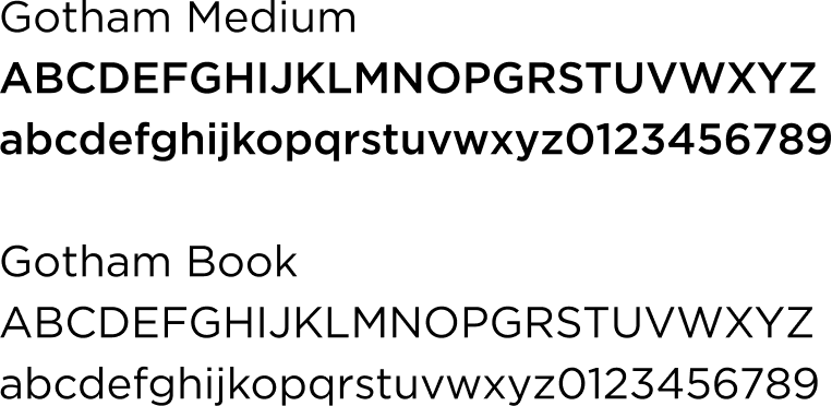
The Gotham typeface is used for social media.
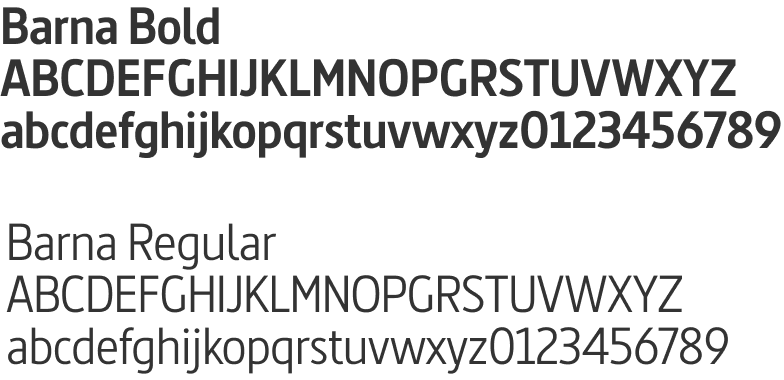
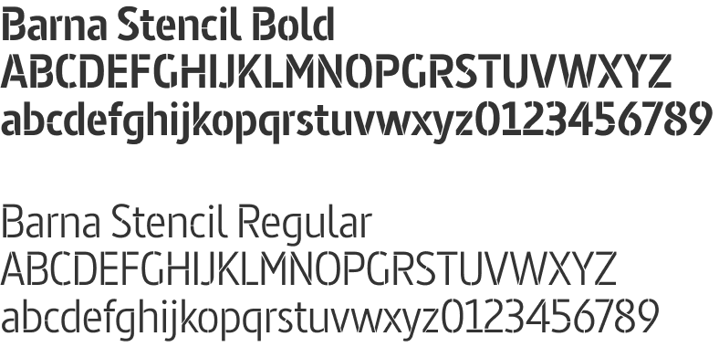
The Barna typeface is used for all on-screen typography for broadcast and arte.tv.
The “Stencil” version of Barna allows the typography to be broken up, for certain uses, to symbolise the idea of ARTE’s cultural magnetism.
Gotham
Barna
Colours
ARTE’s iconic orange colour must always be present, either within the logo, in typographic elements, or as a solid colour in the background of visuals.
In addition to orange, white, black and grey, secondary colours are available depending on the specific application.
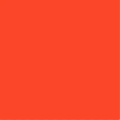
RVB 250·72·28
HEX #FA481C
CMJN 0·71·89·2
PANTONE 172 C

RGB 255·255·255
HEX #FFFFFF
CMJN 0·0·0·0
PANTONE White
RGB 0·0·0
HEX #000000
CMJN 0·0·0·100
PANTONE Black C

RGB 223·223·223
HEX #DFDFDF
CMJN 0·0·0·13
PANTONE Cool Gray 1C
The Opener
The ARTE Opener is the audiovisual signature that introduces the channel’s programmes.
Designed to ensure immediate brand recognition, it comes in several lengths and formats, tailored to different broadcast contexts (web, press conferences, festivals, screenings, etc.).
0:000:00